The Ultimate Guide to Where to Hang Paintings in Your Living Room
The placement of artwork can make or break your living room's design. A beautiful painting in the wrong location loses its impact, while even a modest piece strategically placed can transform your entire space. Understanding where to hang paintings involves considering sight lines, furniture arrangements, lighting, and the natural flow of your room. Let's explore the art of optimal painting placement to help you create a living room that feels both curated and comfortable.
The Primary Focal Points
Above the Sofa
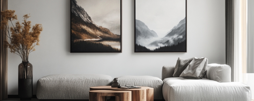
This is the most common and often most impactful location for living room artwork. The wall behind your sofa typically offers the largest uninterrupted surface and serves as the room's primary focal point. When hanging art above your sofa, position the bottom edge of the frame 6-10 inches above the sofa back. The artwork should span approximately two-thirds to three-quarters of the sofa's width for proper visual balance.
For standard sofas (80-90 inches wide), a single large painting (50-60 inches wide) or a diptych/triptych spanning similar dimensions works beautifully. If your sofa sits in the middle of the room rather than against a wall, consider placing your statement artwork on the wall opposite the sofa, where it becomes the view from your primary seating area.
Above the Fireplace Mantel
The fireplace wall naturally draws the eye, making it prime real estate for artwork. When hanging paintings above a mantel, leave 3-6 inches of space between the mantel top and the bottom of the frame—less space than above furniture because mantels are typically more decorative and substantial.
The artwork width should not exceed the fireplace opening width, and ideally should be slightly narrower to maintain balance. Vertical or square pieces often work better above fireplaces than horizontal ones, as they complement the vertical nature of the chimney structure. If your fireplace is the room's dominant feature, this is an excellent location for your most impressive or meaningful artwork.
The Entry Wall
The first wall visible when entering your living room deserves special attention. This "welcome wall" sets the tone for the entire space and creates an immediate impression. A striking painting here can serve as a conversation starter and establish your room's aesthetic direction.
This location works particularly well for bold, colorful pieces or artwork with personal significance. Since viewers will see this piece fresh each time they enter, it can handle more visual complexity or dramatic subjects than artwork you'll stare at constantly while relaxing.


Secondary Strategic Locations
Behind Accent Chairs or Loveseats
Don't neglect seating areas beyond your main sofa. The wall behind accent chairs, reading nooks, or loveseats offers opportunities for smaller, more intimate artwork. These secondary locations allow you to create multiple visual interest points throughout the room rather than concentrating all artwork in one area.
For a single chair, artwork 18-30 inches wide is appropriate. For a loveseat or pair of chairs, scale up to 36-48 inches. These secondary areas are perfect for more personal or quirky pieces that might compete with a statement artwork but shine in their own designated spaces.
Flanking Large Windows or Architectural Features
Rather than competing with windows, embrace them. Hanging matching or complementary paintings on either side of a large window creates symmetry and frames the natural view. This approach works especially well in formal living rooms or spaces with spectacular outdoor vistas.
Similarly, artwork flanking a fireplace, built-in bookshelf, or architectural column can enhance these features rather than competing with them. Ensure the pieces are hung at consistent heights and maintain visual balance in size and subject matter.
Above Console Tables and Sideboards
Console tables and sideboards offer excellent opportunities for layered displays. A painting hung above a console becomes part of a curated vignette when paired with decorative objects, lamps, or plants on the table surface below.
Maintain 6-8 inches between the console top and the bottom of the frame. The artwork should be roughly two-thirds the width of the console. This arrangement works particularly well behind sofas that don't sit against walls or in entryways where console tables serve both functional and decorative purposes.
On Empty Wall Sections
Not every wall needs furniture to justify artwork. Bare walls between doorways, in corners, or along circulation paths are perfect for standalone paintings. These locations work well for pieces you want to showcase without competing elements—the art becomes a destination rather than an accent.
When hanging art on an empty wall, consider the viewing distance. Artwork that will be viewed from across the room can be larger and bolder, while pieces in hallways or narrow spaces should be scaled appropriately for closer viewing.
Gallery Wall Locations
Staircase Walls
If your living room includes or connects to a staircase, the ascending wall provides a dynamic gallery wall opportunity. Arrange paintings to follow the stair angle, creating a diagonal flow that guides the eye upward. This is an excellent location for a collection of smaller pieces (8x10 to 16x20 inches) that might feel lost individually.
Start by hanging the bottom piece at the same height as pictures on adjacent walls, then step up each subsequent piece to follow the stair angle. Maintain consistent spacing (2-4 inches) between frames for cohesion.
Long, Narrow Walls
Walls flanking hallways or between architectural features often feel awkward with single paintings but come alive with gallery arrangements. A horizontal line of smaller paintings creates movement and makes narrow spaces feel more dynamic.
For these locations, linear gallery arrangements work better than clustered grids. Think of creating a visual path that guides viewers along the wall rather than clustering everything in the center.
Above Low-Profile Furniture
Modern, low-slung furniture creates substantial wall space that can feel empty with a single piece. Gallery walls above low media consoles, credenzas, or benches fill vertical space while allowing for creative expression through multiple complementary pieces.
Plan your gallery layout so the bottom row sits 6-10 inches above the furniture, and the arrangement doesn't extend so high that it feels disconnected from the furniture below. The entire gallery should visually anchor to the furniture piece.
Height and Eye Level Considerations
The 57-Inch Rule
Professional galleries hang artwork with the center point at 57 inches from the floor—average eye level for most adults. This standard creates comfortable viewing and should guide most of your hanging decisions. To find the center point of your painting, measure its height, divide by two, and add that measurement to 57 inches minus half the height from the floor.
For example, with a 30-inch tall painting: hang the top of the frame at 72 inches from the floor (57 + 15 inches, which is half of 30).
Adjusting for Furniture
When hanging artwork above furniture, the 57-inch rule may need modification. The general guideline is 6-10 inches between furniture top and frame bottom, but this can push the center point higher than 57 inches. This is acceptable—viewing comfort and proper relationship to furniture takes precedence over strict adherence to eye level when furniture is involved.
High Ceilings Require Different Thinking
In rooms with 10-foot or higher ceilings, strict adherence to the 57-inch rule can leave artwork feeling too low and disconnected from the vertical space. In these situations, you can raise artwork slightly, but maintain relationships with furniture and avoid pushing art so high that it feels like it's floating toward the ceiling.
Consider grouping multiple pieces vertically to fill height without violating comfortable viewing angles. A tall vertical piece or a stacked arrangement of smaller paintings can bridge the gap between furniture and high ceilings.


Placement Mistakes to Avoid
Hanging Too High
The most common error is hanging artwork too high, often because people want to "fill" wall space. Remember that you want to view art comfortably, not crane your neck. If you're questioning whether something is too high, it probably is.
Ignoring Furniture Relationships
Artwork should relate to the furniture below it. A small painting floating above a large sectional looks disconnected and awkward. Always consider the visual weight and width of furniture when selecting artwork locations and sizes.
Blocking Architectural Features
Don't hang paintings where they'll be partially blocked by open doors, lamp shades, or plants. Similarly, avoid placing artwork where it competes with architectural details like crown molding, wainscoting, or decorative ceiling features. Work with your room's architecture, not against it.
Poor Lighting Consideration
Artwork hung in dark corners or backlit by windows becomes difficult to appreciate. Consider natural and artificial light sources when selecting hanging locations. Avoid placing valuable or light-sensitive artwork in direct sunlight, which can cause fading over time.
Neglecting Traffic Flow
Don't hang large paintings on walls where people frequently walk past—someone will inevitably bump into it. Similarly, avoid placing artwork on walls that open doors might strike. Consider your room's circulation patterns and reserve high-traffic walls for more forgiving decorative elements.
Creating Balance and Harmony
Symmetrical Arrangements
Formal living rooms benefit from symmetrical artwork placement. Matching paintings flanking a fireplace, identical pieces on either side of a window, or evenly spaced artwork along a wall creates a sense of order and classical elegance.
Symmetry works particularly well in traditional design schemes, formal entertaining spaces, or rooms with strong architectural symmetry. The eye finds rest and comfort in balanced arrangements.
Asymmetrical Balance
Contemporary and eclectic living rooms often embrace asymmetry, but this doesn't mean id_product placement. Asymmetrical arrangements still need visual balance—perhaps a large painting on one side balanced by a grouping of smaller pieces on the other, or a vertical piece on one wall balanced by a horizontal piece opposite.
Asymmetrical balance feels more casual and dynamic than formal symmetry but requires careful eye to ensure the room doesn't feel lopsided.
The Triangle Principle
When arranging multiple paintings across different walls, imagine forming triangles with your eye as you look around the room. Artwork should be distributed so your gaze naturally moves in triangular patterns from piece to piece, creating visual flow rather than all artwork clustering in one corner or along one wall.
Special Considerations for Different Living Room Layouts
Open Concept Spaces
In open floor plans where living, dining, and kitchen areas flow together, use artwork to define zones. A large painting behind the living room sofa visually separates it from the dining area, while different artwork in each zone creates distinct spaces within the open plan.
Maintain some cohesion through color palette, frame style, or subject matter so the spaces feel connected despite their different functions.
Small Living Rooms
Paradoxically, small living rooms benefit from fewer, larger paintings rather than many small ones. A substantial piece on the main wall creates a focal point and can actually make the space feel larger by drawing the eye to one impressive element rather than scattering visual attention.
Avoid covering every wall with art in small spaces—negative space helps prevent claustrophobic feelings.
Large, Expansive Living Rooms
Spacious living rooms require substantial artwork or multiple hanging locations to avoid feeling bare. Consider creating several distinct seating areas, each with its own artwork, or use oversized pieces that can hold their own against high ceilings and long walls.
Multiple gallery walls in different areas can add personality and prevent the "art desert" feeling that occurs when artwork is too small or sparse for the space.
Practical Installation Tips
Use Proper Hardware
Canvas paintings over 20 pounds require wall anchors or screws into studs, not just picture hooks. Heavy pieces need D-rings and wire on the back, secured to studs or heavy-duty wall anchors. Don't compromise on hanging hardware—a fallen painting damages both the art and your wall.
Create Templates First
Before making any holes, cut paper templates to the exact size of your paintings and tape them to the wall. Live with these templates for a day or two, viewing them from different angles and seating positions. This no-commitment approach lets you perfect placement before picking up a hammer.
Measure Twice, Hang Once
Use a level to ensure straight hanging—crooked artwork is distracting and appears careless. Measure distances from corners, ceiling, and furniture to ensure consistent placement. If hanging multiple pieces, measure spacing between them precisely to maintain uniform gaps.
Consider Professional Installation
For expensive artwork, heavy pieces, or gallery walls with many components, professional installation is worth the investment. Installers have specialized tools and expertise to ensure secure, level hanging that protects both your walls and artwork.
Seasonal and Rotating Displays
Don't feel locked into permanent arrangements. Some locations lend themselves to rotating artwork seasonally or based on mood. The wall above a console table or smaller secondary walls can showcase different pieces throughout the year, keeping your living room feeling fresh and dynamic.
This approach also allows you to enjoy different pieces from your collection without requiring unlimited wall space. Rotate artwork every few months to prevent "visual blindness"—that phenomenon where you stop noticing art you see every day.


Conclusion: Trust Your Eye
While guidelines provide structure, ultimately the right location for artwork is where it looks and feels right to you. Spend time in your living room observing how light changes throughout the day, where your eye naturally travels, and which walls feel empty versus which feel complete.
The best placement balances technical rules with intuition. Stand back, sit in different seats, enter the room multiple times, and pay attention to your instinctive responses. When artwork is placed correctly, it enhances your living experience without demanding constant attention—it simply belongs.
Your living room artwork should bring you joy every time you see it, anchor your furniture arrangements, and create a cohesive design story. With thoughtful placement, even modest paintings become impressive, and your living room transforms from simply furnished to truly designed.